The Evolution of Gale Harold’s Style by WrathofTheives- Fan Post
So, I’ve decided that it needs to be applauded, Gale Harold’s style. His style within the last three to four years, that is. Because considering what he started with, the man has improved. A fucking lot.
Clinton Kelly and Stacy London live by CTPS: Color, Texture, Pattern, Shine. I’ll take you through some of his best and worst moments and evaluate them with Clinton and Stacy’s rulebook, because it’s clearly what the world should live by.
Some may say “What is wrong with that suit?” Well, a lot. Let’s start out by pointing out the fact that it looks like he tried on one of his dad’s suits, figured it was good enough, and then went out.
Color? It’s okay, but not right for his skin tone. Texture? While the tie is a different fabric, it does nothing for the suit itself. Pattern? None whatsoever. Shine? The tie is shiny, but it’s out of place.
That suit is a step backwards from just about everything. It’s one of the most talked about outfits of Gale’s. And it’s not a good kind of talked about.
Color? Sure. But it washes him out. Texture? I guess he can slide on that one. Pattern? The tie has polka dots. That’s about it. Shine? HELL YEAH. But none of it is warranted.
Getting there. But far, far too baggy.
Color? Everyone needs a nice brown suit. Texture? It honestly looks like it’s not too comfortable to touch. Pattern? Nice touch with the striped shirt. Shine? None, but that’s okay. He can take a break from the shine after the last ensemble.
I can hang. Especially if he does that with his lips.
Color? All earth tones, which compliment his skin tone perfectly. Texture? From the sheen of the shirt to the leather of the shoes, he picked a good choice. Pattern? None, but sometimes solids are perfect when put together properly. Shine? The shirt is the right amount of sheen for the event.
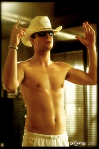
He has a head for hats. Whatever that means. This is one of my favorites.
Color? Earth tones again. Good chioce. Texture? The hat’s woven texture compliments the smoothness of his shirt. Pattern? The band around the hat is perfect for the hat and compliments the color of his shirt. Shine? Who the fuck cares?
LOOKIN DAPPER AS HELL. My favorite recent outfit of Gale’s.
Color? All darker colors, which based on this event, was a perfect choice. I would normally say no to a brown belt and black shirt, but it works, in this case. Texture? The wash of his jeans looks great against the solidness of his jacket and shirt. Pattern? None. He could’ve gone for a subtly patterned black shirt, but otherwise I’m fine with it. Shine? LOOK AT HIS FACE. IT SHINES ALL BY ITSELF.
BAM. Even rockin a motherfuckin scarf. I don’t really like the trench on top of it all, and would much rather have him wear a sport coat, but I can’t nitpick. He look good.
Color? All of the tones go together and the red adds the much needed POP. Texture? With a mixture of fabrics that all blend together nicely, I love the overall texture of the outfit. Pattern? The pattern of the scarf gives great contrast to the solid patterns elsewhere. Shine? Lookin like one fly son of a bitch.


One response to “The Evolution of Gale Harold’s Style by WrathofTheives- Fan Post”
Leave a comment
Click on Gale’s IMDb Page

Posters


Buy The Full Complete Series At Amazon

Whats his relationship status? And sexual orientation?